Day 2 of the Wingtip Press Workshop:
After working for a full day on reductive drawings, we were ready to start the 3 color reduction monotype (also referred to as “stacked monotypes”). Since I didn’t bring along specific images, I chose to work from the previous days pepper drawing.
I should also mention Rose learned from Vinita Voogd who pioneered this process. Vinita taught at Wingtip Press last year.
Fearless leader Rose Davies lead us through the inking process. She combined 60% weight Graphic Chemical Litho Process Yellow to 40% plate oil. After mixing thoroughly, she used a soft brayer to apply a thin coat to the plate.

To check ink application, Rose held the plate up to a light. If splotchy, she could continue rolling the brayer over the plate to achieve an even coverage. Just keep your fingertips off the corners! This was the process used for all 3 plates.
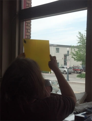
My print: A photocopy of the pepper was placed on top of a light box. This would be my guide in creating the print. To create a solid registration system, Rose recommended using 8-10 layers of tape along two sides. Yowza! That’s a lot of tape! The tape remained in place through all 3 colors. This is key to keeping everything aligned throughout the process.

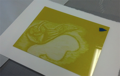
After inking the plate, I placed it over the photocopy and set about removing all areas to remain white, red, blue & purple using Q-Tips. Whew! Kind of tough to keep straight in the brain! I also used tarlatan (scrim), sponges, paper towels and kebab skewers for texture/ink removal. The below image is the yellow plate placed on top of dry paper ready to be put through the intaglio press.
Working the red plate: I was removing the white areas and places to remain yellow, blue and green.

Red plate placed on top of the yellow print. You can see the areas that will blend to make orange. I used a lot of Q-Tips for the entire process!

Blue plate now in process: removal of white, red, orange & yellow zones. Plus toning down the blue so it doesn’t overpower any of the under colors.

Blue plate ready to run through the press.
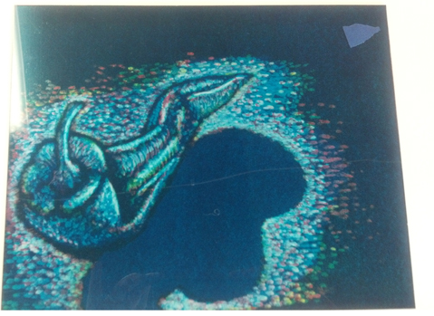
Now the finished print. Overall, this was a challenging process to go through and keep straight. I didn’t manage the black-black background I had hoped for. Part of that had to do with not applying enough ink onto the plates. Part could be from pressure. I also hadn’t planned what colors would go where so the image just developed as I went along. Kind of wild and crazy for me!

Each plate was run through the press twice to achieve 2 separate images. The first sheet captures the majority of the ink. The second produced whats referred to as a ghost image. Basically a less saturated color image. Quite interesting!

One print down, two to go! What will I work on next????
🙂

Wonderful photos, image results and step-by-step commentary!
Where are you pursuing these experiences? Is it a class?
I have a monotype project on the drawing board and would like guidance.
Hopefully wordpress is working better this morning.
Thanks for your comment. This process was from a workshop I took last week by visiting Welsh artist at Wingtip Press in Idaho. If you let me know what area of the world you live in, I bet there is someone in your area willing to help. Printers are like that.
It’s a lovely piece and a great technical write-up
Thanks Rose! Couldn’t have done it with out your expert hand.
Reblogged this on scribblah and commented:
A very clear explanation of the 3 colour monotype process and a lovely set of prints…….
A great description of the process. It is a bit like a suicide lino print, something I haven’t done for years, but am inspired to do the mono!
Oh my, I had forgotten about that terminology! Yes, very much like a suicide lino. 🙂
I’ll be posting 2 more prints I worked through during the workshop.
Thanks so much for your comment!
Gale
Absolutely great. 🙂
thank you! 🙂