Back in May I received a commission. Hurray! Someone really likes my work enough to REQUEST a specific piece! I was initially stumped at the request of color. Personally, I really like the subtle qualities of the River series (off-whites & tans) but I completely understand it not working on the average white household wall. I had already been contemplating adding an element of hand coloring but wasn’t certain how best to approach it. This particular paper doesn’t come in other colors (and I won’t change the paper). Hence a sojourn into claybord color work over the past several weeks. I needed to gain a certain comfort level with layering of colors over a surface. The sheets of paper I’ll be working are much larger than the 6″x6″ squares. They happen to be 29″ x 39″, almost the size of my normal table surface! I also need to make sure the color remains light fast. Acrylic seems to be the way to go.
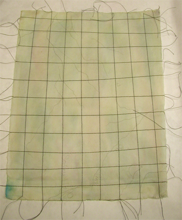
I started working smaller pieces of the same paper type to get a feeling of how it would accept color. First image below is the starting paper color, basically off-white.
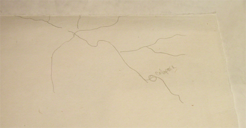
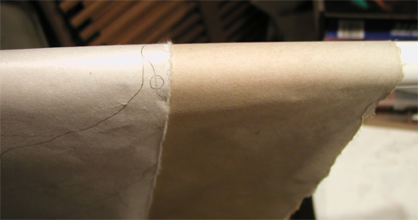
Next is test #1. I used liquid acrylic color washes over the paper. After drying, it was sewed.
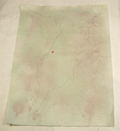
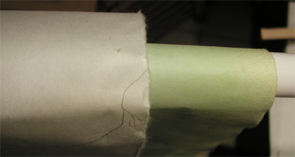
Test #2 used wet paper and the liquid acrylics in a spray bottle. Kind of an interesting effect with this one. Green was applied first then a quinacridone red. Different blending occurred depending on the state of the paper (wet vs dry).
I could see building up color layers with this technique so I pulled out a big sheet to work.
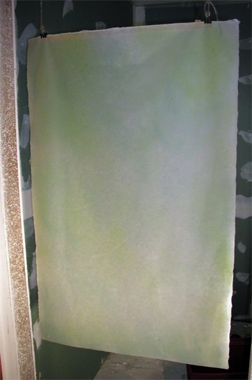

Working with this size paper is a challenge in my cramped space. The weather has been too windy/rainy to work outside so I compromised by using the empty doorway leading into the bathroom. With no flooring or wall surface prep past mud, a bit of acrylic overspray doesn’t really matter. I started working with yellow then shifted into blue and green. I’m not certain this combination is right. Time to experiment with raw umber.
Moving on to sheet #2.

It’s a terrible thing to try and photograph since the camera isn’t able to really show the subtle variations of color. I’ve applied about 5 layers of dilute color from raw umber to yellow, orange and red. It almost looks tea stained, but then you see that some areas have more intense yellow hues and others have a smattering of light quin red. I think this sheet will go farther in the process.

Can’t wait to see what you do next 🙂
It’s progressing but I took a break to clear out the clutter in the studio (and house!). Plus I can’t find the thread for the machine… it’s under a pile somewhere. It might even be put in it’s proper place… if I could find that.
🙂
aaarrgghh I’m always putting stuff in a ‘safe place’ and can never find it again 🙂