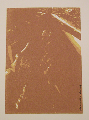
Here is color 3:
Since this is the beginning of the year and I’m trying to get myself better organized, I’ve started to finally keep notes on paper I like for printmaking. So far, my preference is leaning heavily to BFK Rives for screen and etching processes. It accepts ink evenly yet continues to lay flat and not warp. It also has a smooth texture and feels so lovely (a big part of why I like paper so much). It’s also good for drawing. Some of my other papers participating in the print edition are funky… very funky! They won’t see it past my studio doors! Ok, they will see the interior of the recycle bin! Ha!
This print will become part of Leftovers IV print exchange.

yaaayyy Leftovers! I’m entering again this year 🙂
Yippee!!!! Glad to hear it! I hope you post an image of your work since I’ll probably never see it otherwise. Well, maybe when Amy posts things on FB.
🙂
It’s a little etching of Sparta 🙂
Fabulous!
I thought I’d send her abroad 😉
good punishment, especially for all the rats and birds she brings you!
hahaha yes 🙂