In the Maniere Noire style

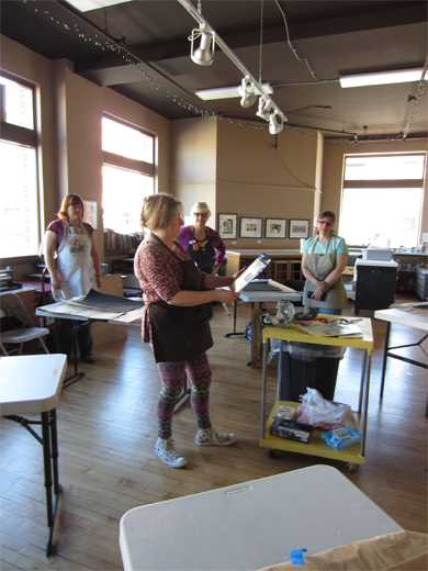
I returned Tuesday from 4 intense days of creating art thanks to the incredible Rose Davies. She traveled from Swansea Wales (yes, from the UK!) all the way to little ol’ Idaho to introduce 6 artists to a more advanced monotype technique. The workshop was offered by Wingtip Press operated by Amy Nack in Boise. Amy, I love your space!!!!

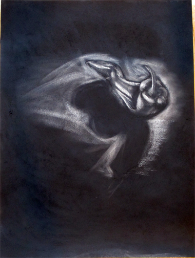
What is Maniere Noir? Basically it’s French for ‘in the black manner’ and often refers to the mezzotint printmaking technique. For our purpose, it refers to a reductive drawing style using charcoal or graphite on paper.  Rose had us spend a day working with the reductive technique to prime our brain cells for 3 days of color reduction.

Rose and Amy prepped full sheets of Rives BFK paper with 2 coats of gesso. They used Hake brushes which left some nice texture.

Wingtip Press studio space. Rose getting us prepped
Wingtip Press studio space. Rose getting us prepped. Cassandra, Amy and Lisa in the background.

We applied a dense coating of charcoal to the primed paper  and rubbed it in with our fingers. This was certainly not a clean process! To remove the black, we used aluminum (carborundum) sandpaper of various grit and steel wool.

Sand paper & steel wool were the main tools used

Rose gave a starting demo using a pepper still life.

Rose giving a demo using steel wool to pull up the pepper image
Rose giving a demo using steel wool to block in the pepper image

Now it’s my turn. I couldn’t resist the pepper! Rose actually re-toned her paper after starting the pepper and took on a chunk of driftwood. I found it fairly easy to scrub off the charcoal and if a mistake was made, I could always reapply more. A forgiving process.

Reductive charcoal drawing of a pepper by Gale Everett on a full sheet of Rives BFK

After a lunch break, we moved on to the second style of drawing: reductive graphite! Prepping the paper required lots of fresh air. Again, we were working on paper primed with gesso.

Graphite toning start

After applying a base of graphite, one takes a rag with turpentine (yes, the real stuff) and wipes it over the surface. This blends the graphite and gives you a much sturdier surface to work on. On the messy scale, it was certainly “cleaner”  than charcoal. Downside was the turp odor. It was also harder to remove the graphite and reach the white of the paper. Not a bad thing, just a different scrubbing intensity required.

Blending using Turpentine.

Tyler H working on his gourd drawing. He has a beautiful hand!

Tyler at work on his graphite drawing

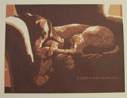
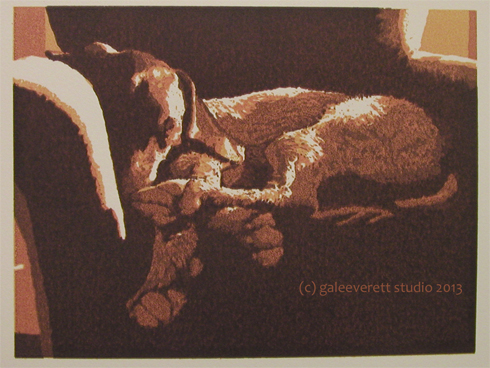
The gourd I worked on below: Note the tools off to the side. More steel wool, sandpaper on sponge, Q-tips (for touching up with a bit of turpentine to get back the graphite black), graphite stick to add in additional lines.

Reductive graphite drawing on Rives BFK full sheet. Gourd by Gale Everett

Three more days to report on plus one incredible day under the Idaho sun searching for petroglyphs and snakes along the mighty Snake River.

🙂

Dogs on Display

It’s official, the dogs are really up. This is the first 2 person show I’ve done since my senior exhibit back in 2003. Kind of scary, but good.

Check out the site at The Arts Center or better yet, get in there and see it for yourself. It will be up until May 25. Art Center gallery hours: Tu-Sat Noon-5

Title: Counter Surfer, reduction screen print, gale everett studio, 2013

Diana Ryan, who shares the gallery space with me, creates very fun ceramics. I’ve heard there is a space alien connection, but I don’t know yet. I won’t be in to view everything until after the workshop next week.

Woof!

Blue Ball

BlueBall_geverett2013
Blue Ball, block and screen print, kozo paper

The 12th and final image for the show. Rogue is finally printed.

The images will be on display from April 30 to May 25  in the Corrine Woodman Gallery at The Arts Center of Corvallis OR.

Oh, there has been a request for all the images on cards (Maria!) and it could happen. I’ll start working on that in June. May is already swamped!  Now it’s time to get ready for Boise ID and Wingtip Press! Woohoo,! An art vacation!

Crazy Fur

The elusive Zeek starting to emerge…

zeekproof4-geverett

Eventually I’ll have to start work on his nose.  Labradoodles have the craziest coats, curls in one area then wavy hair in others. Beards too, kind of like Moby. Maybe that’s why I enjoy their look.

Proofed in a new Burnt Sienna ink, just for the fun of it. Oh, and it’s a block print.

Finished image by the end of today?? That’s the plan!

🙂

Working through problems

color6-geverett

Sleeping dog in sun.  Feet and body in shadows. Warm daylight.

I’m amazed the grainy texture is slowly disappearing as new colors are scraped over the top. The image becomes more resolved as it moves along, an interesting process to witness. My cousin recently commented “for someone who claims not to paint, it’s awfully painterly!” Ok, not her exact words but pretty darn close. I guess I have to agree with her. Reduction screen printing is my form of painting.

color7-geverett

The relationships are changing between colors as the work grows darker. Areas that once were so prominent start to fade, losing their dominance. I think it’s time to start work on resolving the chair. The dog has gone to the color limit.

Amazing, I think I like it.

🙂

Back to the chair

It’s hard to shift gears and revisit a print with issues, but I hope to be able to save it since the show is days away.

Screen-prep-color5

Hidden under piles of other print materials, I managed to locate all the reference paperwork for the image. I work from a color, black and white plus a previous version of the print, drawing directly onto the screen to help guide screen filler application. It was wonderful to use proper base extender for color 5 and leave behind the sticky ink issues. But will the new extender be able to overcome the previous mishaps? White could solve it but I’ll lose the transparency. More to ponder. Below is the 5th color applied.

color5-geverett

His toe pads are showing through along with the full side of his flank. This print might just make it through the process and have an interesting textural quality to some of the layers. I think white might enter into the next color.