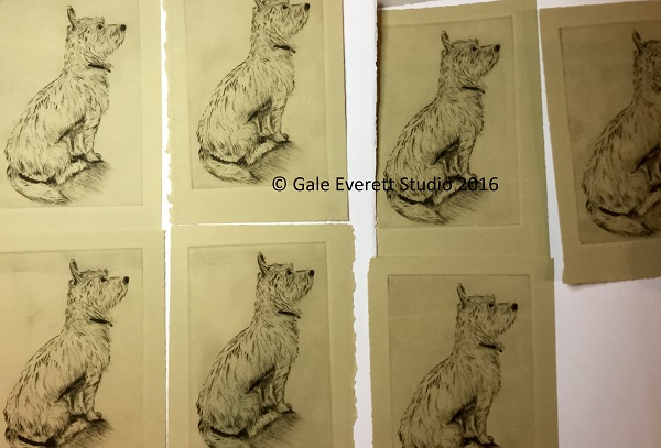
Halfway through the edition I realized that the recycled print paper is changing how the image comes out. I chose to tear apart old test proofs from an India series of screen prints from university days. The backs are beautiful and pretty clean, unfortunately I can tell where the screen print starts and stops on the flip side. This is a pattern that I’m not liking since it is dramatically changing the plate tone in the background. I want it clean not filled with crazy patchy toned zones! Its bad enough that I don’t want them leaving the house with my name on it. The current title is “waiting for breakfast”, since Ms Hazel happened to be in the kitchen when I took the photo used to aid the drawing. It might change to “Patience” or “Focused”.
I’m ok with the general image for now. I do see issues but they just need to be there for now. The edition needs to be completed and sent off on Saturday. I’m pulling out scrap white paper and will be running the remaining edition on that (and possibly reprinting the first 7).
Drypoint on copper, oil based ink
Cairn Terrier

I do like ‘Waiting for Breakfast’ though. It looks exactly like what she is doing.
It’s her normal stance in the kitchen. She’s the first dog to spend so much time evaluating everything done. I swear she’s going start cooking one day. 😉
Hahahaha 😁 ‘helping ‘ like Sparta
As I have a little Westie doing just that look, while she waits for me to get off the computer and on to the vastly more important job of getting her breakfast, waiting for breakfast has my vote. Karen
😄 Waiting for Breakfast seems to be a winner. The terrier stare down is quite impressive. We’ve never experienced this level of intensity!
Your westie is such a cutie!