I feel like I’ve stacked the deck for failure with this print by incorporating way too many variables. First, I chose to use a different screen and registration system. Both of which are yielding enormous headaches on their own. Then I chose an image with multiple value changes. Not a horrible thing, but certainly more challenging for registration. Next issue is the use of older inks and extenders. Hmmm, that is proving to be a really bad thing. Maybe this will become an image that reads great from a distance, but looks like crap close up!
This is color 4 on straight computer paper. Not terrible, paper wrinkled during drying process, but the ink was grabbed by the paper texture.

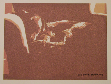
When it is applied to the working print, the ink fails to adhere and 90% of the image looks bad.
So, what’s happening? The ink doesn’t want to release from the screen. It has kind of an alligator crackle appearance when you look at it closely. Maybe it’s all to do with the extender being too old. It certainly doesn’t flow well at all! I think it’s time to visit the art shop. I have to make a trip to Eugene anyway…. Might as well stop by Oregon Art supply and see what they have.

Ah – it is that old adage – use what you have. Well, now you know, and you can get rid of the things that aren’t working and restock with what does. See? You were ahead of the game for spring cleaning! All it took was some work and frustration! Haha. Can’t wait to see the finished Moby.
Oh my dear, you are the optimist! Yes, time for a little studio clean out and it might help to clear my head too.
🙂
The perils of the arty life 😦
Oh yes. Sometimes trying to save money isn’t a good thing. Rather than screen printing, I played with the press today! 🙂
Ugh!
Always so much failure…rarely do I work out all the glitches until I reach satisfaction. But it’s important in printmaking.
Oh so true! Failure happens with everything and it’s good to show. Maybe in a few days when I’m feeling better it will get revisited. 🙂