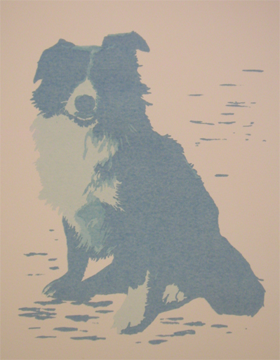
Sunday I managed to lay down more color on Hobie. The shifts are small between the three images, but it should make an overall difference by the final product. I have one week remaining before taking all the completed work in for the show!!! Yikes!!!

The image is printed on white, not a creamy/peachy colored paper. Room lighting and how close the image is shot creates the difference.
One more color for the day.
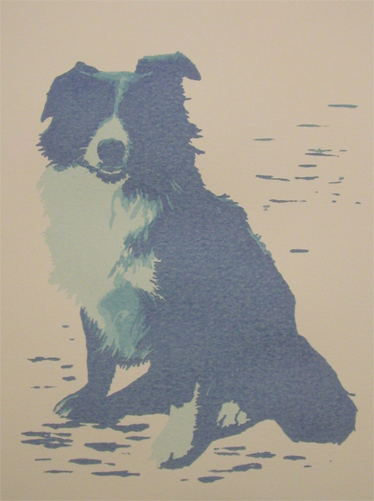
Such subtle changes! It almost wasn’t worth doing that color shift. Color 6 will probably make a difference. I think that will have to wait for tomorrow. The last color placed was very violet! Ah, the joys of transparent colors! Love it!
🙂

Gorgeous. I love working with transparent colours too, the interplay is amazing.
Thanks! It’s certainly been a fun experiment. I might have to keep the reduction screen prints going. 🙂