This was today’s “quick” drawing of a sun-bleached whelk shell brought back from Kauai. I think I must be wanting to head to the coast. Maybe I just want to be back in the islands away from responsibilities of life? Dreaming of less stressful days…. Anyway, it was an interesting exercise even if I didn’t quite get the correct proportions. Maybe I’ll have to venture onto a larger paper when I figure out a subject to pursue.
Charcoal plus red & white conte crayon in a 8.5″ x 12″ Vang sketchbook from France.
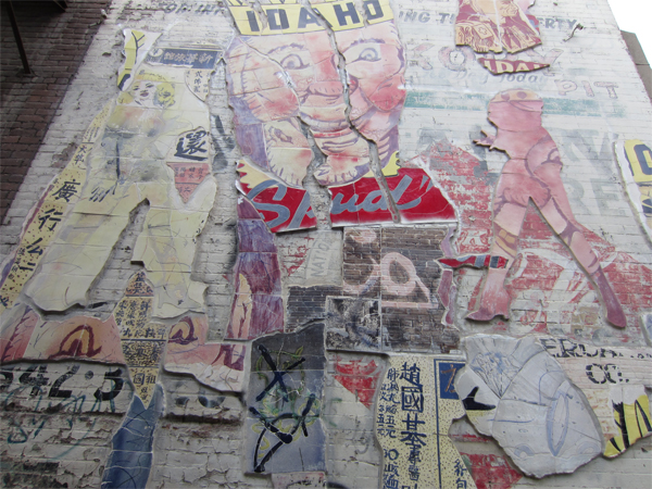
I always feel fortunate when the opportunity arises to visit a larger city outside my normal stomping grounds. One thing that always shines is the public art. There were many works to visit and only a few captured by camera as we wandered around on First Thursday.
Amy Nack provided Rose and I with a general direction to explore. Our main destination was the “Modern” where a once a year art event takes place in cramped hotel rooms. Ever seen metal sculptures displayed in a shower? How about an artist resting in a bathtub as you look at prints taped to the bathroom walls? Beds covered in slabs of wet clay? Those were just a snippit of what we experienced. Some artists paid for several nights to set up full room installations with rolled up cardboard and twinkle lights. All in all, an interesting and overstimulating experience. Not one for people who don’t like crowds.
I did manage to get a shot or two of the happenings outside. Music, drinking and lots of happy people!
Wandering around downtown Boise, one can encounter the brightly dressed traffic control boxes. I loved them! What a great way to get flat art out onto something dimensional! The magic of vinyl coverings….
I didn’t see the name on this work but I could assume it had something to do with Tentacles and Tanagers…
One of my favorites was right next to Wingtip Press!
The hills around Boise with a Labrador. I loved it!Side view of traffic light control box.
One of the artists in our class Lisa Flowers Ross had participated in the public art boxes. Please check her website for images of her 2public artworks. The photo I took of her piece was horrible. Please, check her site!
There were several alley ways with public art. This one had an enormous ceramic tile mosaic.
I didn’t get an image or video of the musical light posts or all the incredible graffiti work in some of the alleys. Oh, and the river piece… Maybe on my next visit.
Personally, I think my local towns need to think about the covered traffic boxes…. Corvallis?
Keyhole Limpet in charcoal. 18 May 2013. Gale Everett
A Keyhole Limpet shell. They resemble little volcanoes, which is very appropriate for today. Back on Sunday morning May 18, 1980, Mount St Helens in Washington State erupted. The entire house shook with the explosion, stronger than any sonic boom I had experienced before. We lived in Eugene, approximately 150 miles south of the mountain. A morning that will remain in my mind forever. It certainly impressed me at age 10! Fortunately for our community, the major ash flow went east. We received a good coating, but nothing like Portland or other closer communities.
I wonder what mountain in our area will erupt next?
Rain. I didn’t expect it to really come, having hoped to do a bit more yard work today. Not that a little rain will keep me from the outdoors! But here we are, Moby & I, spending some quality time indoors exploring pencils and charcoal again. I probably should be experimenting with a watercolor wash over kozo paper for a commissioned piece. Maybe on Friday!
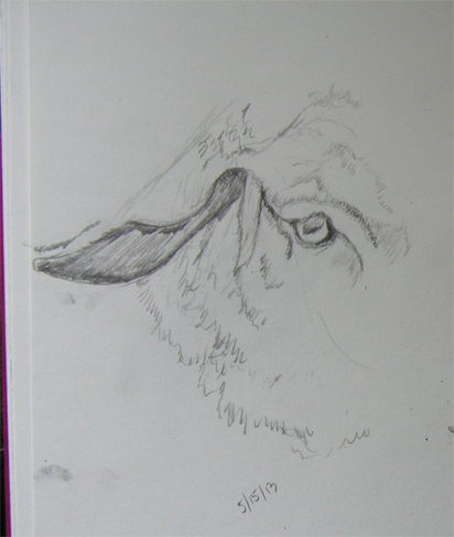
I decided, while in Idaho, to get serious about sketching. Today seems like a great day to pull out the sketchbook and try a little. I think the blank pages are sometimes hard to get started on. Anyway, here is what I picked: another quick sheep in pencil… looking at eye/ear placement. I’ve started to grow fond of sheep. 🙂
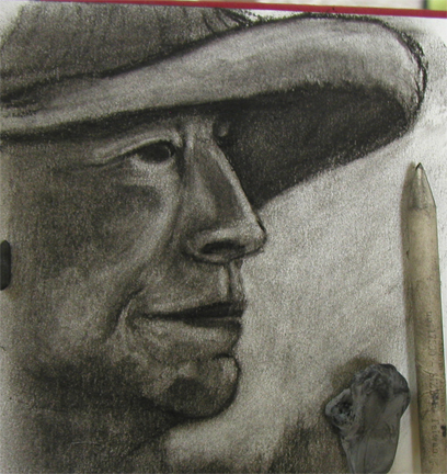
Next, I went a bit crazy trying to figure out a face. I won’t say who it is, cause it doesn’t look a bit like them! I can’t recall the last face I’ve done. So many placement issues but fun to practice with! I think you, dear readers, will be subjected to my bad drawing for weeks to come! Ha!
Looks like the sun is starting to break through. Time to get outside!
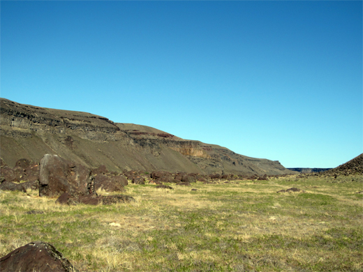
We took a break from the workshop to go on a small adventure into the wilds of Idaho. We headed out to the Snake River to look for petroglyphs and peregrine falcons. Here are some images from the area.
Lizard!
Lizard variety #2
The one snake Rose DID get to see. A non-poisonous Gopher Snake!
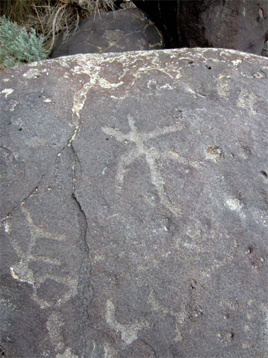
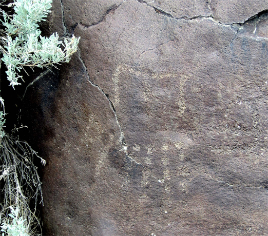
Petroglyphs at Celebration Park
This one makes me think of an owl for some reason.
Well, they certainly had lizards back when these were pecked out of the rocks!
Rose working on quick sketches of the petroglyphs.
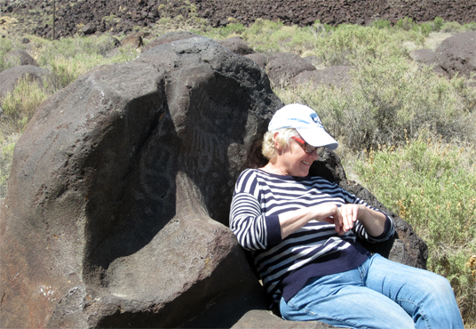
Amy Nack in a “comfortable” chair decorated by ancient artists.
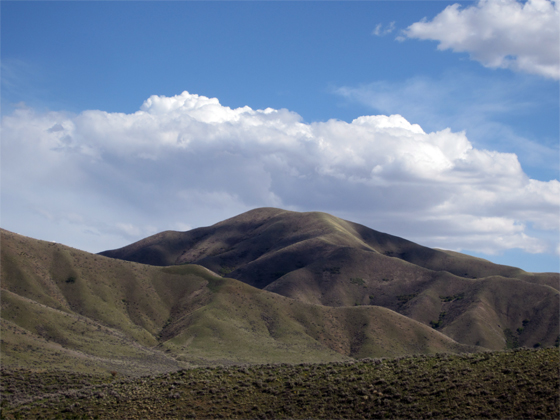
The drive to Idaho City was beautiful.
And finally the biker bar in Idaho City. Rose got in a quick sketch of some of the activity.
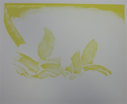
Since I don’t have a lot of time today to work through the petroglyph trip (thanks to my procrastination with pulling together an installation art proposal due at midnight May 12) , I thought I should just pop up the images of the final print. For this image I took a journey through my sketchbook and found a colored pencil drawing of a single Christmas Cactus bloom. The plant itself happens to be one of my oldest, having received it on my 8th or 9th birthday from my brother Tom. It still lives on…. 35 years later! This was the first image I worked with a color reference on site.
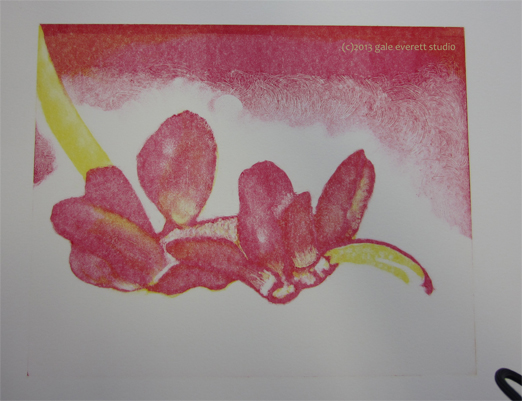
Below are photos of the results of each plate on Rives BFK paper. This process is printed dry. Rose strictly measured 60/40 litho ink to plate oil. I personally thought this mix was too runny, especially with the final color.
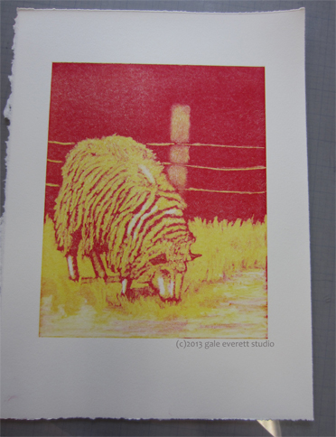
yellow plate resultsRed and yellow together. I almost could have left it at this stage!
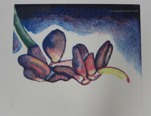
Now the final addition of blue. I need to note that the blue was of different consistency than the previous days. I couldn’t remove it in the same way because it kept sliding and creeping back into cleared zones. Major bummer!
The final full color image.
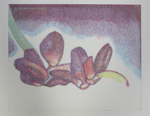
I actually really like the ghost of this image better than full color.
Christmas Cactus, ghost image
I’m really looking forward to playing with this technique more at home. Time to boot the cat off his comfy Takach sleeping platform and get back into something fun.
Thanks to Rose Davies (aka Rosie Scribblah)for making such a great connection with Wingtip Press.
Day 3 & Print #2 at Wingtip Press Studio workshop on Stacked Monotypes
Rose worked us hard! Plus we were flat mates and spent evenings chatting and cooking dinner. I had to pull myself away from an extended evening chat just to get drawings sorted for this print. Fortunately, I seem to have landed on a good subject: Sheep. Saturday morning, with drawing in hand (scanned and reversed on the computer) I ventured into the second print. I think we all felt more confident having made it through our first image with quite a bit of success.
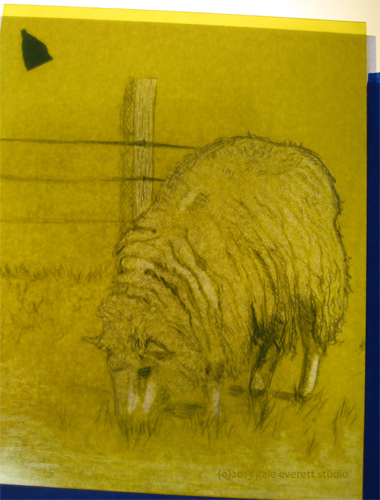
Starting the yellow plate on top of the lightbox.
How much ink to remove? That became quite a quandary for this image. On the last print, I felt the yellow was lacking and was hoping for a gentle gradation of color via sheep… we shall see.
Yellow ready to print.
What I discovered was my application of ink happened to be stronger on this round. More ink could have removed during the yellow plate. Also the texture scribbled in with the kebab skewer didn’t show squat. Note to self: use blue layer for finer texture!
On to the red plate:
Working the red layer on top of light box.
I felt more confident in removing lots of red. Will it be enough?
Red layer ready to print over yellow
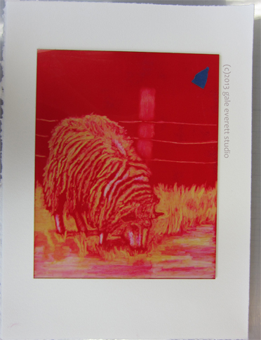
Now for the two colors on paper. Oh, that yellow is mighty bright! Guess this will be a sheep of a different color!
Two colors down on sheep print.
Since I roughly guessed at some of this layering, the final blue was going to be more difficult.
Lots of color needed to be removed for the green to appear.
Working on the blue plate.
Did I make the right choices? Should I have removed more blue in the coat? Will the background turn black enough? I keep having to remind myself that this is a learning process.
Blue plate over other two colors and ready to print.
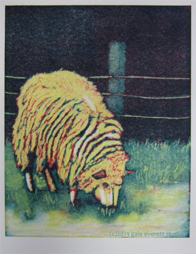
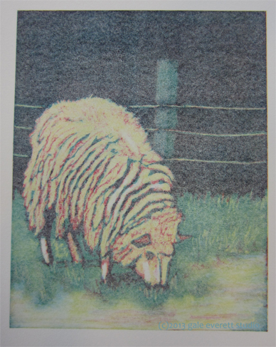
Below is the finished full color print. I learned quite a lot working this second image.
Full color sheep print.
Now the softer ghost image.
Ghost print of sheep.
You can see more work by our intrepid leader at Rosie Scribblah.
One more print to go PLUS our field trip into the wild Idaho landscape! Oh, and even a few shots of Rosie drawing petroglyphs! The Artist at work!
We came back to Idaho from Oregon today and made a couple of sketching stops. It was boiling hot, around 29degrees C or 90F and we were on a tight schedule so only had enough time for a quickie or two. This was drawn from a rest stop in the mountains on The Oregon Trail, at Burnt River – at one point we were over 4,000 feet up.
I scribbled this in oil bars onto a canvas sheet prepared with oil-based litho/relief ink squeegeed on at random and left to dry.
This artist residency has been supported by Wales Arts International and Arts Council Wales.
Coming to a workshop fairly unprepared isn’t the greatest feeling, especially when images are what it’s all about! Fortunately, my computer was loaded with a variety of photos so I spent some time sketching before the second print. I’ve spent the last many months working on dogs images, so why not switch to a different critter?! Sheep! To tell you the truth, I’ve never drawn a sheep before in my life and my sketching has become dis-attached from brain to hand. I think this is my new goal, to improve the attachment between these two areas. Anyway, the ewes belong to my very good friends Carol & Harry. We spent Easter afternoon watching mothers and lambs graze on new grass and romp about. What a beautiful day! I doubt I could have captured them so clearly if I had attempted to work in the field. I probably should give it a try. Live moving models are a big challenge! The top image was the one I chose to work from for monotype #2. Rather a big challenge to portray the woolly-ness of these gals in flat art!
The amazing sculptor Henry Moore published a book on his sheep sketches in 1972. I think I’m going to find a copy cause it’s pretty cool! Mary, one of the workshop participants, brought a copy in for me to look through. He had quite a good hand!
After working for a full day on reductive drawings, we were ready to start the 3 color reduction monotype (also referred to as “stacked monotypes”). Since I didn’t bring along specific images, I chose to work from the previous days pepper drawing.
I should also mention Rose learned from Vinita Voogd who pioneered this process. Vinita taught at Wingtip Press last year.
Fearless leader Rose Davies lead us through the inking process. She combined 60% weight Graphic Chemical Litho Process Yellow to 40% plate oil. After mixing thoroughly, she used a soft brayer to apply a thin coat to the plate.
Rose inking Perspex (plexiglass) plate in yellow
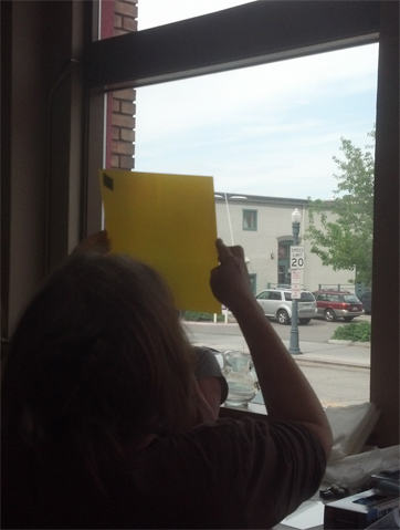
To check ink application, Rose held the plate up to a light. If splotchy, she could continue rolling the brayer over the plate to achieve an even coverage. Just keep your fingertips off the corners! This was the process used for all 3 plates.
Checking coverage of ink
My print: A photocopy of the pepper was placed on top of a light box. This would be my guide in creating the print. To create a solid registration system, Rose recommended using 8-10 layers of tape along two sides. Yowza! That’s a lot of tape! The tape remained in place through all 3 colors. This is key to keeping everything aligned throughout the process.
A photocopy of my drawing with tape registration guides
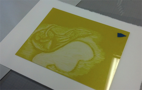
After inking the plate, I placed it over the photocopy and set about removing all areas to remain white, red, blue & purple using Q-Tips. Whew! Kind of tough to keep straight in the brain! I also used tarlatan (scrim), sponges, paper towels and kebab skewers for texture/ink removal. The below image is the yellow plate placed on top of dry paper ready to be put through the intaglio press.
First plate ready to run through the press. It’s already placed on the paper.
Working the red plate: I was removing the white areas and places to remain yellow, blue and green.
Working on red ink plate over the light box.
Red plate placed on top of the yellow print. You can see the areas that will blend to make orange. I used a lot of Q-Tips for the entire process!
Red plate situated on top of the first yellow print. Ready to run through the press!
Blue plate now in process: removal of white, red, orange & yellow zones. Plus toning down the blue so it doesn’t overpower any of the under colors.
Final plate in process.
Blue plate ready to run through the press.
Blue plate over the top of the first 2 colors.
Now the finished print. Overall, this was a challenging process to go through and keep straight. I didn’t manage the black-black background I had hoped for. Part of that had to do with not applying enough ink onto the plates. Part could be from pressure. I also hadn’t planned what colors would go where so the image just developed as I went along. Kind of wild and crazy for me!
Finished image! Monotype pepper by Gale Everett
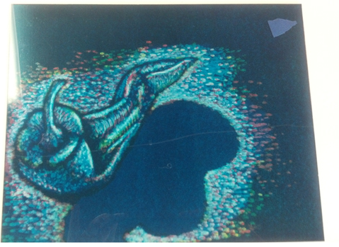
Each plate was run through the press twice to achieve 2 separate images. The first sheet captures the majority of the ink. The second produced whats referred to as a ghost image. Basically a less saturated color image. Quite interesting!
Ghost image of pepper by Gale Everett
One print down, two to go! What will I work on next????