Blue Dog: Is it finished??

How much more can I go? Well, it looks like one more step might do it.  Right now, the image is not fully resolved. My value shifts were not dramatic enough to really push the coat changes (which makes it readable from a greater distance). So, now I ponder creating one more screen using a drawing and photo emulsion.

Below is the full run of changes made to the print thus far with their color.

Hobie-Changes-geverett

Current print state

hobie-strip-geverett

The texture of the paper certainly influences how ink is deposited.

hobie-color8-geverett

One more round and Blue Dog will be finished…. I hope!

Darkening the dog

hobie_color6-geverett

There are always parts I want to go back change in any of my prints. Certain sections that should have received more shadow, certain colors that really didn’t alter much. For the most part, I think it’s going alright (except for that foot). I’m still learning how far to push values and resolving an image. Restraining myself to blue was more challenging than previous prints. Granted, I’ve actually printing violets over the blue to warm things up, so it’s not all blue I’m working with. It’s just a shift to a different section of the color wheel.

Next color might not have been dark enough. I went through a couple of tests and screen washings to get to this.

hobie-color7-geverett

Today, I had a studio partner. I think he just wanted to keep me from working. He happened to lay down RIGHT in my pathway to the drying rack. Silly dog!

studio-partner

He had me up at 4:30am and that certainly put a crimp on my brain. I should finish the print Tuesday. Hopefully Dave will return from Victoria BC tomorrow and life back to normal.

Dog Form Emerging

Sunday I managed to lay down more color on Hobie. The shifts are small between the three images, but it should make an overall difference by the final product. I have one week remaining before taking all the completed work in for the show!!! Yikes!!!

hobie_color3-geverett

The image is printed on white, not a creamy/peachy colored paper. Room lighting and how close the image is shot creates the difference.

hobie_color4-geverett

One more color for the day.

hobie_color5-geverett

Such subtle changes! It almost wasn’t worth doing that color shift. Color 6 will probably make a difference. I think that will have to wait for tomorrow.  The last color placed was very violet! Ah, the joys of transparent colors! Love it!

🙂

Hobie: Start of the colors

hobie_color1-geverett

That first color is always a big quandary. What color to start with? Did I chose a light enough blue or not?

Well, the first is down and now it’s on to color two…

hobie-color2-geverett

I think it will all work out. It always seems to! Maybe one more color for today before calling it quits. I just wish it was warmer in the house. Makes everything go a bit more quickly.

I can already tell this print will be tougher than originally thought. All the wispy hairs sticking out are dead give- away for off kilter registration. So far, so good.

Drawing Fluid Friday

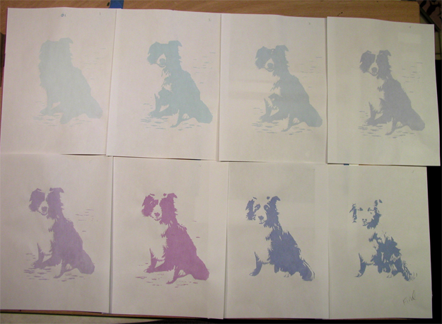
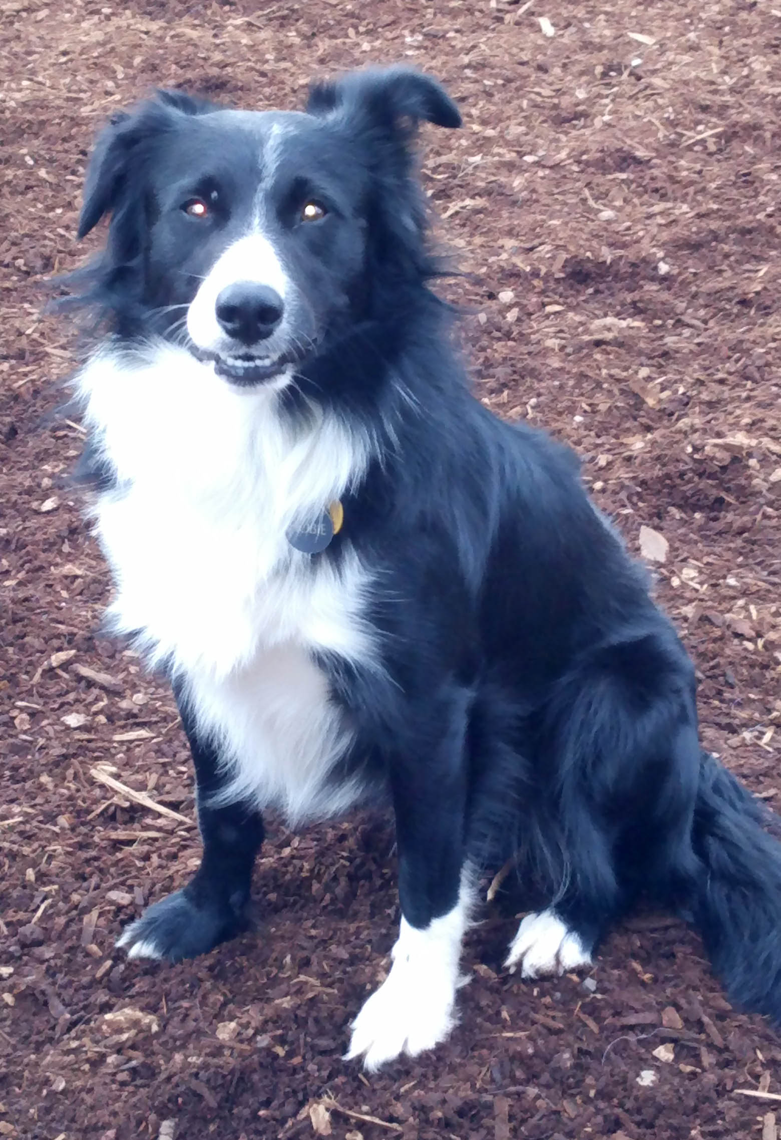
I’m always surprised at how long it takes to get everything prepped and ready for a new print. Paper cut, screen cleaned and ready, drawing situated under the screen to transfer. Blah, blah, blah!  The new image is of  a border collie named Hobie belonging to good friends Jim & Kate. I decided to take a little different approach to blocking in the image by using Drawing Fluid.

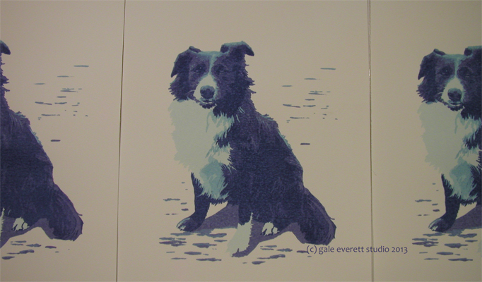
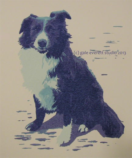
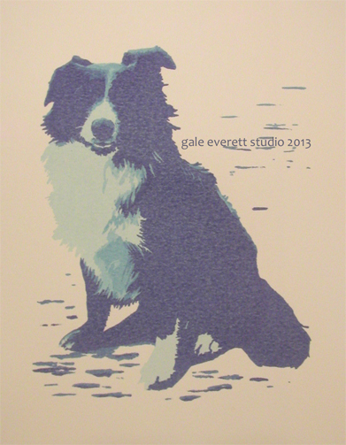
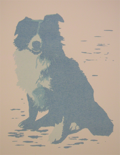
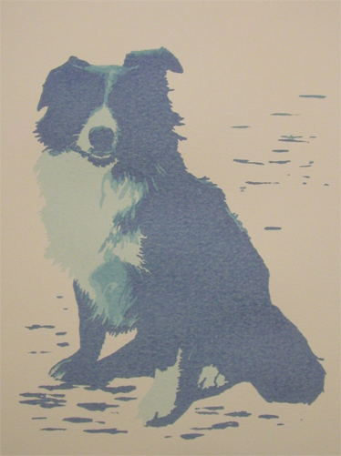
First let’s see Mr Hobie who is a great buddy of Moby. This photo already screamed print due to the value shifts in his coat. Who would have thought a black dog could have so much going on?! He already looks so blue in the image, so blue it will be, including the outstanding white chest. He won’t be situated on the brown mulch of the dog park and no glowing eyes. He’s such a handsome guy!

hobie 1

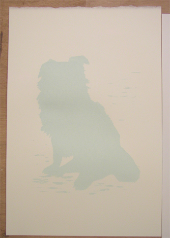
Now the Drawing Fluid!

DF-geverett

It’s kind of a nice process and very low tech. I apply the blue fluid to areas that will eventually remain open. You’ll see what I mean in a bit.

Step one: Apply blue drawing fluid to all areas you need to remain open.

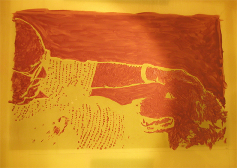
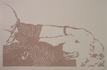
Below is the screen  with the blue stuff applied. I’m having a hard time trying to decide what to do with his body shadowing on the ground. I almost think the light on that cloudy day was coming from behind.  I’m still not finished with blocking in the ground shadows.

DF3-geverett

Step 1.5: Dry your screen thoroughly!!! The big key to drawing fluid is letting it dry ALL the way. Plus you’ve got to make sure all areas you need open are covered by blue (bubbles in the fluid can often remain open so check your screen before step 2). Try using a hair dryer to speed things up. Now why didn’t I think of that earlier…

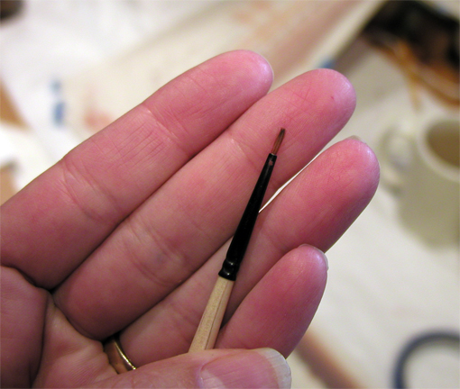
Step 2: Apply Screen Filler. I happen to use a trough from a friend. It’s very handy for this sort of work or for application of photo emulsion. Of course, I never took a photo of it but here is the image with actually three coats of screen filler. It was dried in-between layers.

screenfiller-hobie-geverett

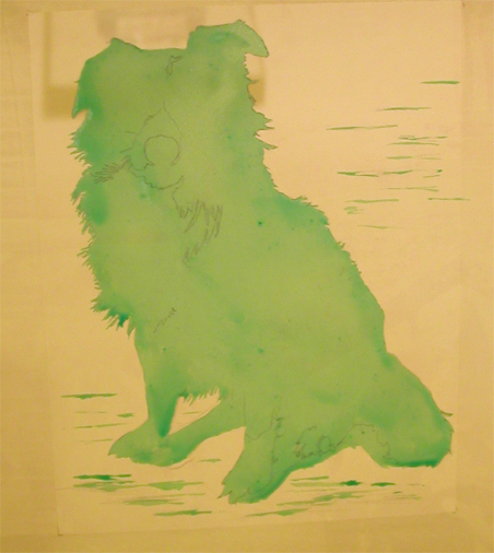
After drying, you take the screen and wash it with cool water.  Theoretically, all the blue zones wash out clean. I ended up having to do more scrubbing than usual. The screen filler clung to areas shouldn’t have. A new lesson learned!  So, 3 coats was too much. I lost some of my ground lines which was unfortunate.  On the plus side, all the coat  wispy bits remained intact.

Once everything gets dried off, I’ll be ready to print.

Colors to come!

Old Friends

oldfriends_geverett2013-w

Here they are at last, hot off the press… well, screen anyway! Taking an extended break from the screen and colors isn’t always a good thing. I lose track of where and what I’ve been doing, not to mention the color scheme for the piece. Nothing is ever perfect and life is all about learning, so that’s what I’m doing.

So here’s to Old Friends, may we all live into our golden years together!

Making things pretty

matting-Moby

Thursday, I took a break from printmaking and delved into another art, the art of matting. It would be fun to just pin prints to the wall, but galleries tend to frown on this. They do like images presented in a clean format with mat and frame.  I think this is the reason I don’t work exclusively in the 2D world. There really is an art to presenting work. During school, everyone learned how to cut mats and window openings plus framing. Being a perfectionist freak, I managed pretty well. Images were always placed with equal margins for both sides and top with the bottom margin being larger: 3″ was always the minimum size with 3.5″ for the bottom. Museum board became my preferred board choice due to the higher cotton content  which gave a smoother cut, but it was double the price.  The last time I did framing on a major scale was in 2003 during my senior exhibit. Was it really that long ago??  Now, 10 years later, I’m back in the same world. Frightening! For this show, I’ve budgeted about 2 days of work to cut, mount and frame all 12 images. Over the past two months, supplies have been gathered to accomplish the finishing touches. Frames ordered during discount times, the purchasing of museum board and receiving a discount to be used on my next purchase (if I could only find my alumni card to receive a discount during the purchase, that would be ideal!) and glass cut by a local shop.

Many people opt to have someone else do all that work for them. Personally, I think those folks have some pretty big bankrolls to be able to do that! Last fall I did a small test at a local shop: I had them cut a very basic mat for a small print (mat size 8″x10″ with a window of 4″x5″). It was perfectly centered on inexpensive board and cut in under 4 min using a computerized system.  With this perfection came a surprising charge of $10. Seriously? $10 will purchase a full Crescent  board 36″x40″, or covers half the expense of a full sheet of museum board. A full sheet will yield about 6 mats+, depending on how large or small you need. This doesn’t cover the back board, I’m just talking about the front window section.

So, rather than investing a large sum for someone else to cut mats and window openings,  I spent 6 hours cutting 12 mats with backs to my specific proportions. I’m out of practice and there were slight overcuts in some corners but hardly noticeable with the museum board. Was it a savings? In a way yes, since I controlled the pricing but the time spent was certainly a chunk.  A bit of time was saved by keeping a running list of the image size and dimensions required for each image. Part of the process is now complete with mounting and framing remaining. Glass still needs to be ordered on Monday. Oh, then there is the last few works to finish once supplies arrive next Tuesday. For now, I have a few more days to carve away on the last blocks completing Zeek and Rogue.

Taxes too… should be a fun weekend!

🙂

Hieroglyphs of the Heart

It’s always nice to inspire others, especially good friends! Here is a piece created by Cynthia Spencer, an incredible artist and person. She had a great show in Portland last fall that featured several works incorporating wire and paper. I feel lucky to own one of her early trials into this combination. Makes me want to work again in ceramics….. Maybe when I get more space!
🙂

workinclay's avatarSpencer Work in Clay

Cynthia Spencer Hieroglyphs2

This piece completed for a show at Guardino Gallery, Portland in October 2012. I blame my friend Gale Everett for getting me interested in using wire and paper as an expressive means. After doing a workshop with her all I wanted to do was make vessels with  which I could use this technique. So different than glazing chemistry and cooking.

The little pieces in the bottom are small porcelain wishbones. This piece is 16 x 16 x 6″ – $500.


View original post

Oh so close, but not yet finished!

Tuesday my eyes and lower back were acting up.  Just what I need right now! The eye thing is probably allergy related. Anyway, I experienced several glitches with the screen. First, I struggled with deciding where to draw the line between color 6 & 7.  The darker values are a lot harder to decipher. More prep before jumping in would have helped.  After making that decision, I had an overly happy brush that got carried away with screen filler. I ended up having to scrub out and redo the dog’s eye and another section. At least I caught my mistake before going forward on the good images!

By the end of the day I really only had one color down and a testing of the next. The first image is the 6th color.

color-6-geverett

I’ve also run out of transparent base so there will be a bit of a break before completing the image. In fact, I’m not certain I have enough to finish the run of purple (color 7). Not a real problem since I want to fidget with the image a tad more. The print below was one of my test pieces (printed on the back of an old print, recycling at it’s best!) showing the application of purple. Tuesday night I placed my order for the last 3 frames and more transparent base.

color7-geverett

The shirt folds are more pronounced and his glasses show that much more. Julie now has a true liver nose and wonderful dark lips.

Thanks for checking in!

Explaining a process

Monday morning I received a nice email from Lois. She has been following along with Julie & Glenn’s progress, but her husband hasn’t. Tim, you should really be keeping up! LOL! I sent her a quick run through using “The Lick” print (the one prior to this image). I also mentioned showing the screen for this print, giving him a better idea of what’s going on.

Below is the screen ready to print the fifth color. All the red stuff is screen filler (yellow is the screen) which is applied prior to every color change. It doesn’t get washed out nor do I exchange screens. This is what’s referred to as a reduction screen print.  One keeps filling/blocking off more of the screen with each change of color.

screen5_jng_geverett

I always run a test on white computer paper to make sure the blockage and color are correct. The results for the above screen are as follows….

screen5_w_jng_geverett

So, when I place the screen & ink over the print containing all the previous color changes, you get ….

jng_color5_geverett

Pretty cool! The remaining two colors will refine the image even more.

Now, the tool that does most of the technical work is one little brush. I received it during an ArtFest workshop but for the life of me, I can’t recall which class. Who ever it was RAVED about this little brush and made sure we all had one. She must have been a painter… Marybeth Shaw possibly?  It’s label says: 3/0 Black Gold by Dynasty. I’m not a painter, so it doesn’t matter much except it works for my application.

brush

Guess I better get back to work!